Where the Action Is

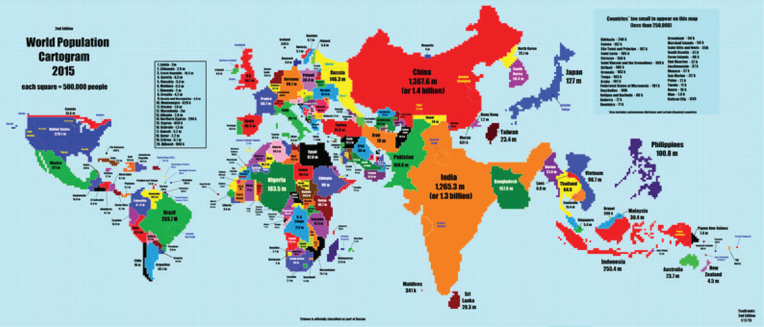
Let’s see where the action is! When you look at the geographic map of the world, you’re actually looking at several major distortions. First, unless you’re looking at a globe, the map will show Antarctica, Greenland, Iceland, Canada and Australia as much larger than they actually are, while equatorial areas like the middle of South America and pretty much all of Africa appear diminished from their actual size.
The map also makes some of the larger countries look more significant to the world’s affairs than they actually are. The accompanying map here shows the nations of the world enlarged or diminished proportionately according to their population, rather than their land mass, which is actually a much better measure of which countries have the most (current and future) impact economically. By this measure, nations like Canada, Australia and especially Russia suddenly become relatively small, while southern Asia, Mexico and Indonesia expand dramatically. Europe, the U.S. and Brazil are, interestingly, roughly the same size on both maps.
Source:
http://www.vox.com/2015/1/27/7918377/population-cartogram


