Taxes Up (but not so much as you might think…)
 Taxes Up (but not so much as you might think…)
If you think taxes are higher than their historical rates, well, it depends on how far back in history you’re comparing them to. Take a look at the accompanying chart, which shows tax revenue as a percent of total national income for four countries—France, Sweden, the United Kingdom and the U.S.—since 1868. The chart ends in 2008, and is taken from research by tax policy analyst Thomas Piketty.
People who think taxes are too high will note that today’s total tax haul is much higher today than it had been during the period from 1868 through 1940, and the spike due to World War II’s considerable expenses was never compensated for by a fall back to previous levels.
However, notice that the total for America has largely leveled off in the past 30 years, and most especially notice that the U.S. share of total income, at 27.5%, is considerably lower than the other countries. Both France and Sweden are flirting with 50% levels, while the U.K. is just above 35%. In the case of the U.S. and Britain, total tax levels are largely unchanged since around 1960—which is not something you hear in Presidential or Congressional debates about our tax rates.
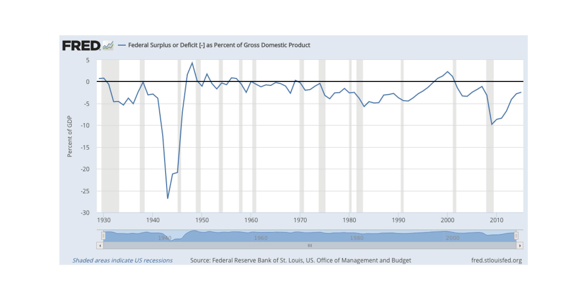
You also aren’t hearing much about the growing national debt these days, in part because the rate of growth has slowed dramatically and is now at or below historic averages. The accompanying chart shows an encouraging trend of federal deficit as a percentage of U.S. GDP; the black line represents a zero budget deficit, which was breached briefly during the Bill Clinton presidency. The dip starting in 2008 represents the historic government bailout which was designed to address the Great Recession and global banking crisis that began in 2008.


