Economic Progress
 It’s not uncommon to hear people wish that we could return to the “good old days,” when the world seemed more prosperous. Of course, depending on how far you go back, the “good old days” might cover a time when the world was poised on the edge of a nuclear precipice, when the Soviet Union and other communist governments basically enslaved more than 50% of the world’s population, when racism was practiced openly and codified in the legal system, when there was no Internet or smartphones, and when TV entertainment consisted of three or sometimes four channels on a heavy, small-screen device that didn’t include a remote.
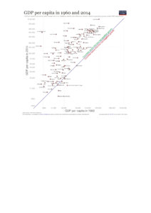
If you consider our world’s economic history, it actually appears that most of are, today, living in the good old days. The chart, from the website Our World in Data, shows the change in GDP per capita since 1960—a measure of whether individual countries have increased their overall wealth in the past 54 years. The dots are individual countries, and if you look at the placement of the dots, you can see the average GDP in 1960 (along the bottom) vs. today (along the left side). The line moving diagonally across the graph is important; any country whose dot falls above that line has experienced positive GDP growth per citizen.
As you can see, pretty much all the dots are above the line, in many cases far above. The highest per capita GDP country today is Luxembourg, followed by Singapore, Norway and Switzerland. The U.S. is on the upper right side of the graph, meaning that it was one of the most prosperous nations in the world in 1960, and still is.
The countries at the bottom of the graph, Central African Republic and Niger, started poor and became more so over the past 54 years. For them, the “good old days” weren’t so great, but they were better than today.
Source:


