Pictures That Tell a Story
They say a picture speaks a thousand words, and that means, to an economist, that sometimes it’s easier to communicate something complicated with a chart or a graph rather than a lot of explanatory text.
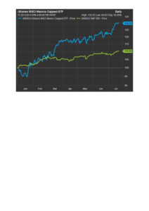
So it is with three charts and a picture, selected for the eye-opening perspective they offer. The first, in the black outlines favored by a Bloomberg Terminal, shows the fluctuating value of an ETF that is invested entirely in the largest stocks on the Mexican stock market (blue line) vs. the American S&P 500 (green line) since the beginning of this year.
 You may remember that when President Donald Trump took office, with his tough talk about trade and his promise to scuttle the North American Free Trade Agreement for something more beneficial to U.S. interests, the conventional wisdom was that the Mexican economy would hit a rough patch and the tougher trade agreements would benefit the American economy.
The month of January, when the new President took office, saw Mexican shares drop on the dire expectation that NAFTA would be ripped up and the Mexican economy would groan under the weight of tariffs. But look what happened. When it became clear that the campaign “promise” was nothing more than empty boasting, the Mexican market has not only recovered; it has roared ahead of the U.S. over the first six months of the year.
So much for the conventional wisdom you were hearing from pundits and Wall Street stock touts.
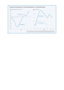
 The second chart, in pale blue, illustrates another interesting point. You remember the great trauma that Americans experienced in the Great Recession of 2008-9, and you might be tempted to think that even in the depths of the Great Depression, people didn’t have it any worse.
Au contraire! Take a look at the left side of the chart, where the darker line represents the remarkably steep decline in total economic output across the U.S. business sector over the 11 years from 1929 to 1940. You can see that the economy declined by a full 30%, and it took seven years before America had regained its former economic strength.
Still on the left side, notice the less bold line. That represents the decline in GDP experienced by American citizens in the Great Recession—and you can see that the decline never even reached 5%. Not only was the dip less traumatic, but the recovery was much faster, and the growth that is sometimes derided as “anemic” is at least steady.
The right side of the graph portrays the unemployment rate, again with the bolder line showing the experience of the Great Depression, and the pale line showing unemployment rates during the 2008-9 Great Recession. Once again, the people in the 1930s experienced a much tougher economy than anything more recent participants of our recession had to face.
So if you hear a grandfather say that people had it a lot tougher in the 1930s than they did in that mild rainstorm we call the Great Recession, believe them.
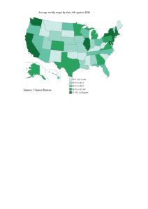
 Now let’s look at the map of the U.S., which shows, in color contrast, the average weekly wages in each American state. The darker the color, the higher the wages; the highest are found in New York, New Hampshire, Massachusetts, New Jersey, Maryland, Illinois, Washington and California. In contrast, people in South Carolina, West Virginia, Kentucky, Mississippi, Oklahoma, Arkansas, New Mexico, South Dakota, Montana and Idaho have the lowest per capita income. What is interesting about the map is that except for Texas and Kansas, the color codings tend to look a lot like the political divide in the U.S. between red states (generally lighter colors on this map) and blue states (darker and tending to be toward the coasts. Can politics really be that simple?
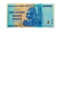
 Finally, take a look at the one-hundred-trillion dollar banknote issued by the troubled African nation of Zimbabwe. This is an example of what happens when a nation simply prints its currency in unlimited amounts in order to pay for its government activities. This bill was actually a replacement for pre-2006 Zimbabwean dollars, and was equal to a number of the previous currency so large that there isn’t a name for it—a one with 27 zeros after it. Yet this new bill was soon worth a fraction of a U.S. penny.
You already know the lesson here: bad, inattentive or corrupt governments produce bad outcomes.


